

Jan 01,2024
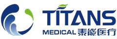
Titans Medical LOGO brand-new upgrade starts a new journey!

If enterprises want to cross the industry cycle and be stable and far-reaching, they must be more active in innovation and change, actively adapt to the market situation, and further reshape the enterprise structure. With the rapid and innovative Titans Medical, the logo of Titans Medical has also been comprehensively upgraded.
Enterprises are not static but dynamic
Enterprise is a constantly changing need to change with the times and the situation Enterprises always learn from the past and learn from the new in constant adaptation.
Corporate image serves the enterprise and corporate culture complements each other
Compared with business development, corporate image building is a relatively long time The high-speed growth of enterprises also needs to be updated to match the new needs of enterprises.
In the iteration and inheritance, the enterprise logo shows two sides of "standing" and "breaking"
On the one hand, the new version of the logo of the enterprise is relatively stable and retains a large part of the old logo; On the other hand, the new version of logo is changing, which changes with the growth of the enterprise itself and the external changes, so new elements are added.

Interpretation of the new logo of Titans Medical
The first half of the logo is based on the hand shape of grasping the momentum. Based on Titans Medical, glove products are the mainstream product line. Compatible with design elements such as waves, water drops and green leaves, it presents the meaning of guarding hard work and growth. It conveys the corporate mission of Titans Medical to protect health and "build every barrier for human health protection". At the same time, it also embodies the core values of "safety and health".
The logo color is mainly Titans blue and vegetation green, which conforms to the attributes of medical protection industry. It integrates the concept of health protection, love, tolerance and vitality, and conveys "love, safety, health, innovation and professional integrity" The blue of the waves and the green Shui Mu of the source of Yuemu are constantly flowing, and the layers of waves aroused show vigorous vitality and majestic strength, which means the corporate vision of "building Chinese brand strength and building a century-old Titans Medical care".
The overall shape is framed by circle and square. Fiona Fang is the integration of rationality and sensibility. It is the double interpretation of scientific and technological innovation and human care. It shows the corporate attitude of Titans Medical, which is inclusive of all things and protects health. At the same time, it shows a high-spirited and confident attitude. It is neither humble nor towering, and conveys that Titans Medical adheres to the harmonious coexistence of global health and high quality.
Keywords:
Hot Information
Beyond Medical Protection: Taineng Medical’s B2B Supply Solutions for Household Cleaning Gloves